


To investors,
Will Clemente breaks down this week’s bitcoin situation using on-chain metrics to separate the signal from the noise. You can follow Will on Twitter or sign up for his email by clicking here. Here is Will’s analysis:
Hope all is well, and you’ve had a great week. After a sweep below range lows, it looks like price action is starting to reflect some of the trends we’ve been following over the last few weeks; but we’re still not out of the woods yet. In the short term BTC needs to clear $36.5K, $41-42K, and then ultimately get above its 200-day moving average. I personally see getting back above that 200DMA as confirmation of bull run continuation, but others may have different opinions as to what that level of confirmation is. Let’s dive into this week’s on-chain overview. Hope you enjoy!
Key takeaways from this week’s newsletter:
Still not out of the woods… yet
RSI sitting beneath 7-month resistance
Volatility looks ready for a breakout
Funding remains negative
Buyers with little selling history continue to accumulate heavily
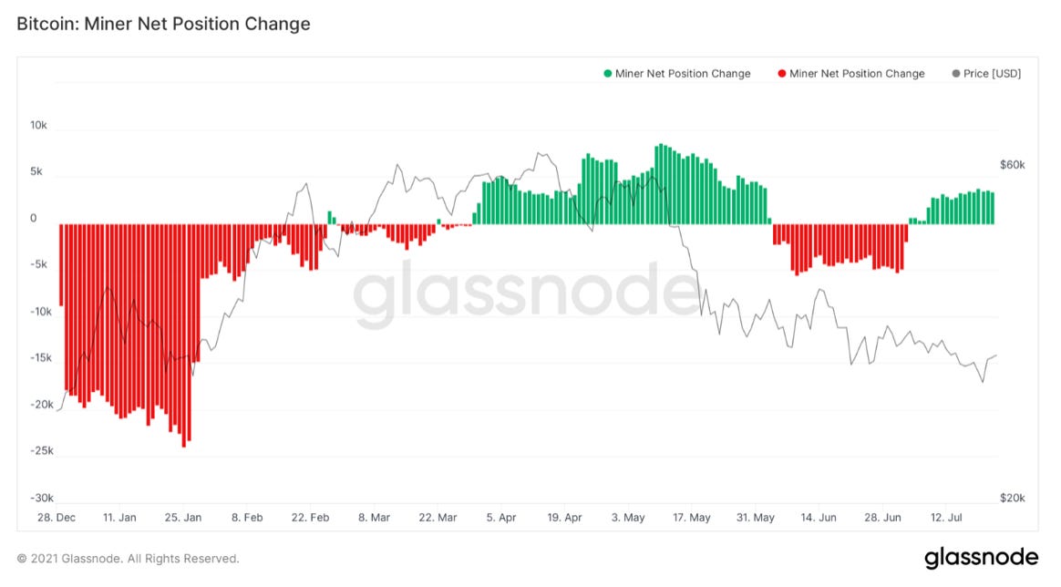
Miners are accumulating
Strong outflows from OTC Desks
Supply squeeze very much in play
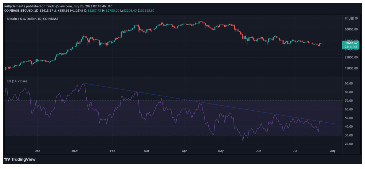
First up we have a rare appearance from a technical indicator on this newsletter, the RSI. The relative strength index is a momentum tool that helps identify overbought and oversold zones. On the daily, the RSI has been in a downtrend for 7 months. This downward sloping trend line has served as resistance 8 times. At the time of writing, it looks like we’ve broken out above the trend line, but will need to see confirmation at the daily close. Something to keep an eye on for sure.
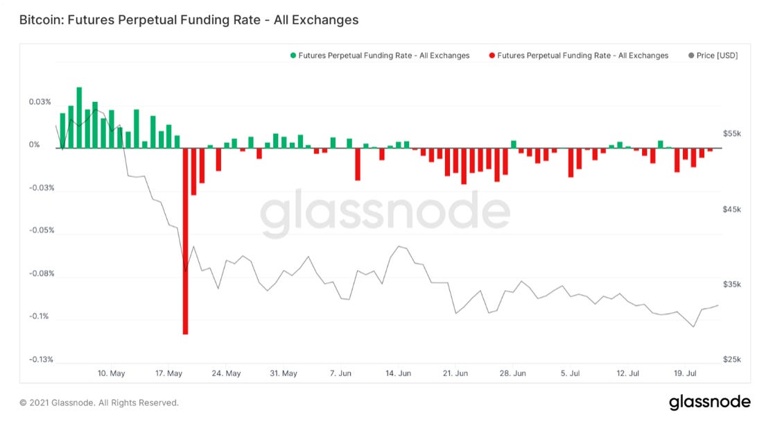
Another non on-chain indicator that I have my eye on closely is the perpetual funding rate. This is the mechanism that pegs the perp contract to the index (weighted average price of all major exchanges). When funding is positive, longs are paying shorts to keep their positions open; when negative, vice versa. As a rule of thumb, prolonged positive funding = bearish, prolonged negative funding rates = bullish. We’ve seen mostly negative funding rates since late May, the last time we’ve had prolonged negative funding like this was following the covid crash. Funding being negative means twofold: 1. Sentiment from traders is bearish 2. Spot BTC is being bought more aggressively than futures. Seeing funding stay negative throughout this pump over the last 24 hours shows we could potentially be setting up for a short squeeze.
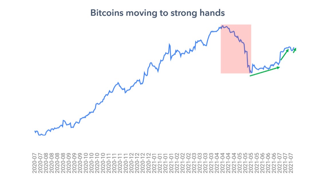
There is certainly underlying accumulation going on. Here we have the liquid supply ratio, showing movement of coins from weak to strong hands. Looks like we’re starting a potential third local leg up. We went from slow grind up in the ratio to more aggressive accumulation over the last few weeks. Bitcoin’s supply shock is currently equivalent to levels it was at earlier this year between $50K-$60K BTC.
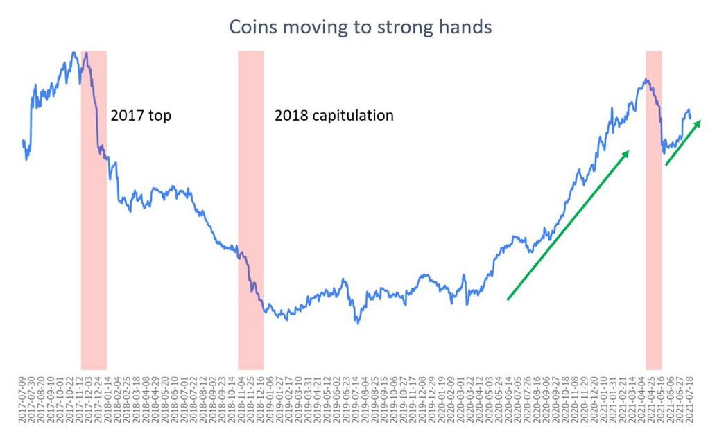
Zooming out, we can see how a drop off in the ratio would have helped time the 2017 top and 2018 capitulation during the bear market. We can also see how the lockup of coins squeezed Bitcoin’s price upwards through a massive supply shock in 2020. However, in late May we saw a reversal of that; young whales selling that likely were likely taking a momentum trade or capturing a market-neutral spread between spot/futures. After the tidal wave of coins became liquid, it was stated in the newsletter that the re-accumulation process would take some time. As mentioned in the previous paragraph, this process has gone from a slow grind up to a more aggressive climb recently.
Next up we have another indicator I created, the OTC Outflow RSI. This is showing the strongest buy signal since July of last year. Looking at OTC outflows/inflows on an intraday basis can get quite noisy, so this shows clear outliers of strong OTC outflows or lack thereof. Essentially, it’s an alternative way to measure buying strength from institutions/high net worth individuals. This has provided some nice signals over the last year, but the reason why I place emphasis on this signal is because of how strong it is.
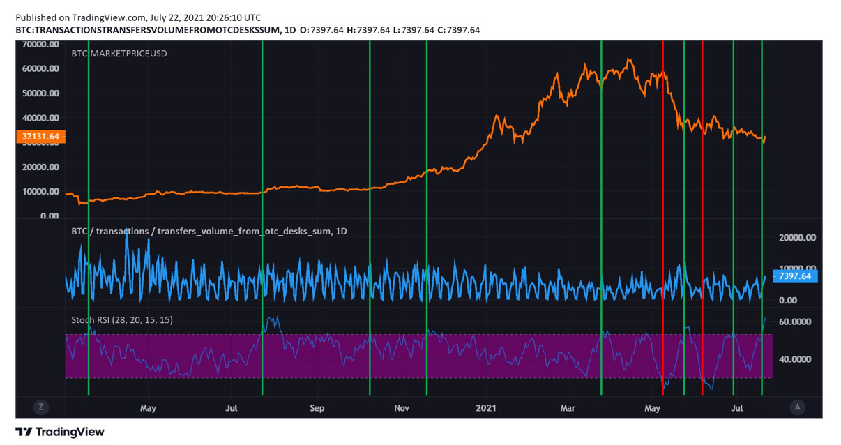
Here’s another way at looking at this but measuring OTC outflows against inflows.

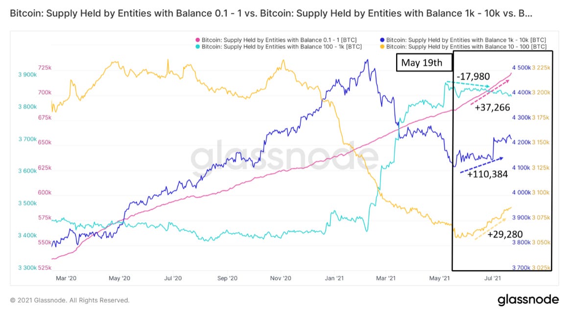
Going deeper on who has been accumulating, here’s a breakdown of each major cohort’s accumulation behavior. I would have added more but, Glassnode only allows me to compare 4 charts at once. Just to preface, I’m using the May 19th capitulation as a starting point for these numbers. Seeing very strong buying from retail, along with buying from mid-sized entities holding between 10-100 BTC; retail +37,266 BTC and octopus/shrimp adding +29,280 BTC. As far as the big boys, dolphins and sharks have actually been slowly selling; reducing their holdings by -17,980 BTC. The number of coins this 100-1K BTC cohort was adding to their holdings at the beginning of this bull market was unprecedented. And lastly the whales with 1K-10K, adding 110,384 BTC since May 19th.
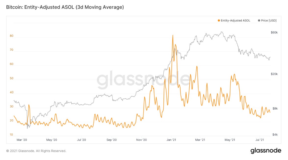
Overall, selling is coming from younger market participants. This can be seen in coin days destroyed/dormancy, but that naturally trends down in times of low volume. So, here’s ASOL: average spent output lifespan. Currently a better way of understanding where selling is coming. This essentially measures the average age of coins being sold. The trend down means the average age of coins being sold are younger and younger. Weak hands.
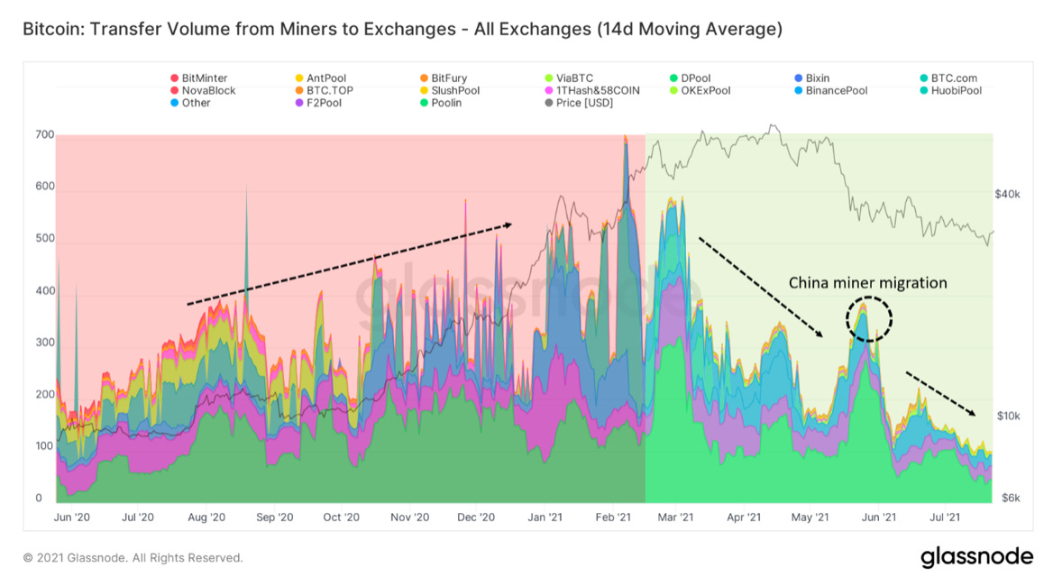
Selling has not been coming from miners though. To show this we’ll look at transfer volume from miners to exchanges and miner net position change. As you can see transfer volume to exchanges has been in downtrend since February. Despite a move up during the China mining ban/migration, this continues down showing reduced sell pressure from miners.
Here’s the miner net position change metric. This is looking at the 30-day change between miner balance. Looking at the raw balance can be useful, but when you start to see a move in net position change you can confirm that trend in the data. This is once again showing a trend of miner accumulation.
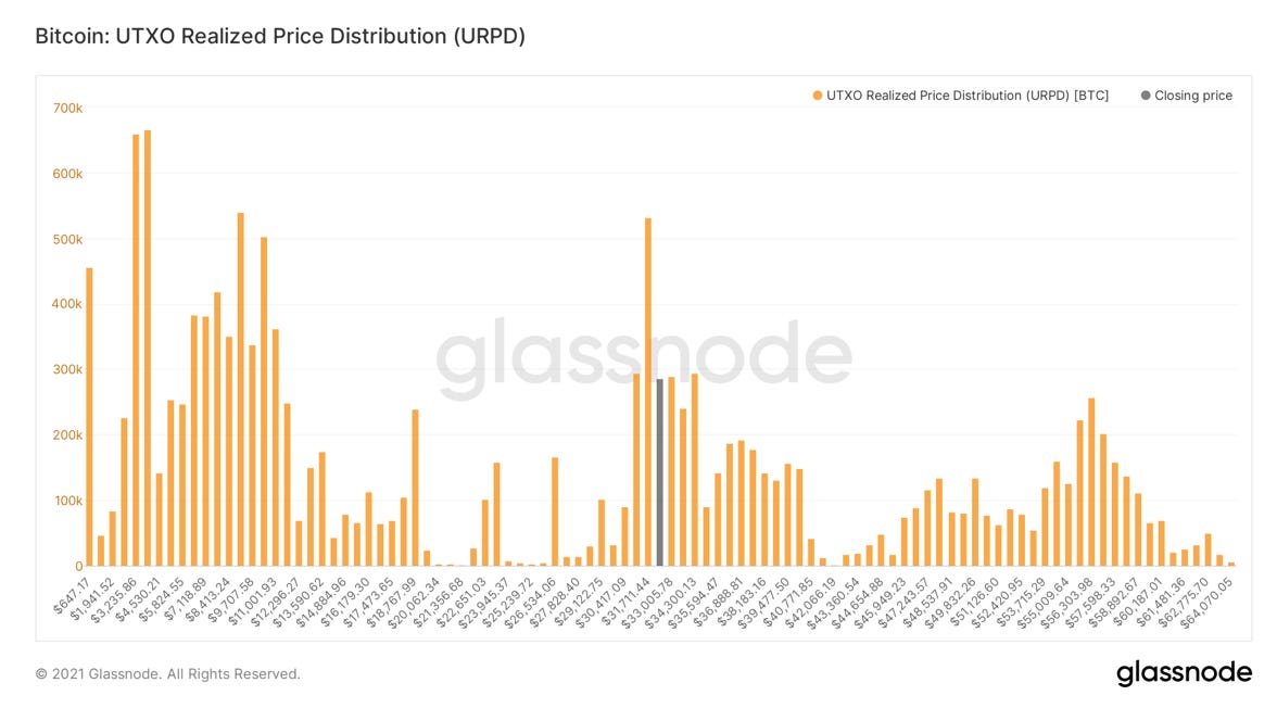
Lastly, we have one of my favorite charts, UTXO realized price distribution. In other words, it is showing how much Bitcoin is moved at each price level. We are back in the middle of a massive zone of volume after looking over the abyss when we went below $30K briefly. And check out that huge bar of volume sitting at $31,700; the largest since $10,300.
Hope you guys enjoyed this week’s overview and tune in to tomorrow’s podcast; back to just me and Pomp. Anyway, looks like it’s going to be a fun weekend. Cheers!
That is it for today’s analysis. Hopefully you found this helpful. I highly suggest you subscribe to Will Clemente’s email where he breaks down on-chain metrics multiple times per week: Click here
SPONSORED: Amber Group is a leading global crypto finance service provider operating around the world and around the clock with a presence in Hong Kong, Taipei, Seoul, and Vancouver. Founded in 2017, Amber Group is committed to combining best-in-class technology with sophisticated quantitative research to offer clients a streamlined crypto finance experience.
The platform now services over 500 institutions and 100,000+ individual investors across the Amber Pro web platform, the Amber App, as well as their 24/7 trading desk. To date, Amber Group has cumulatively traded more than $330 billion across 100+ electronic exchanges, exceeding $1 billion in assets under management. In 2019, Amber Group raised $28 million in Series A funding led by global crypto heavyweights Paradigm and Pantera Capital, with participation from Polychain Capital, Dragonfly Capital, Blockchain.com.
Click here to sign up now.


Is A Short Squeeze Upon Us?