


To investors,
Will Clemente breaks down this week’s bitcoin situation using on-chain metrics to separate the signal from the noise. You can follow Will on Twitter or sign up for his email by clicking here. Here is Will’s analysis:
Hope all is well, and you had an awesome week. Bitcoin showing some strength, but now we watch for the follow through over the next week. We’ll look at key levels to watch for as well as patterns to keep an eye on from an on-chain perspective. Hope you enjoy, have a great weekend! Let’s dive in.

Here’s some key takeaways from this week:
Bitcoin still consolidating below resistance at the top of a multi-month range
Every cohort in net accumulation, retail leading the way
Both qualitative and quantitative measures of supply shock/shortage showing strong upward trends
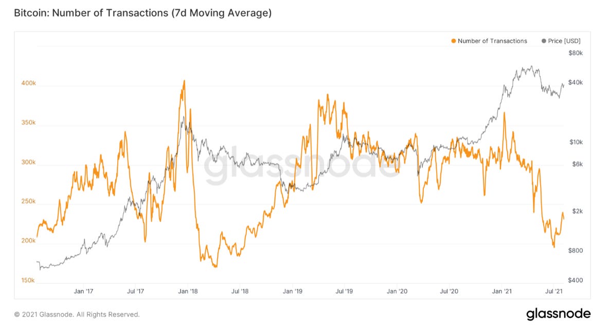
On-chain activity still quiet, less transactions but bigger sized transactions
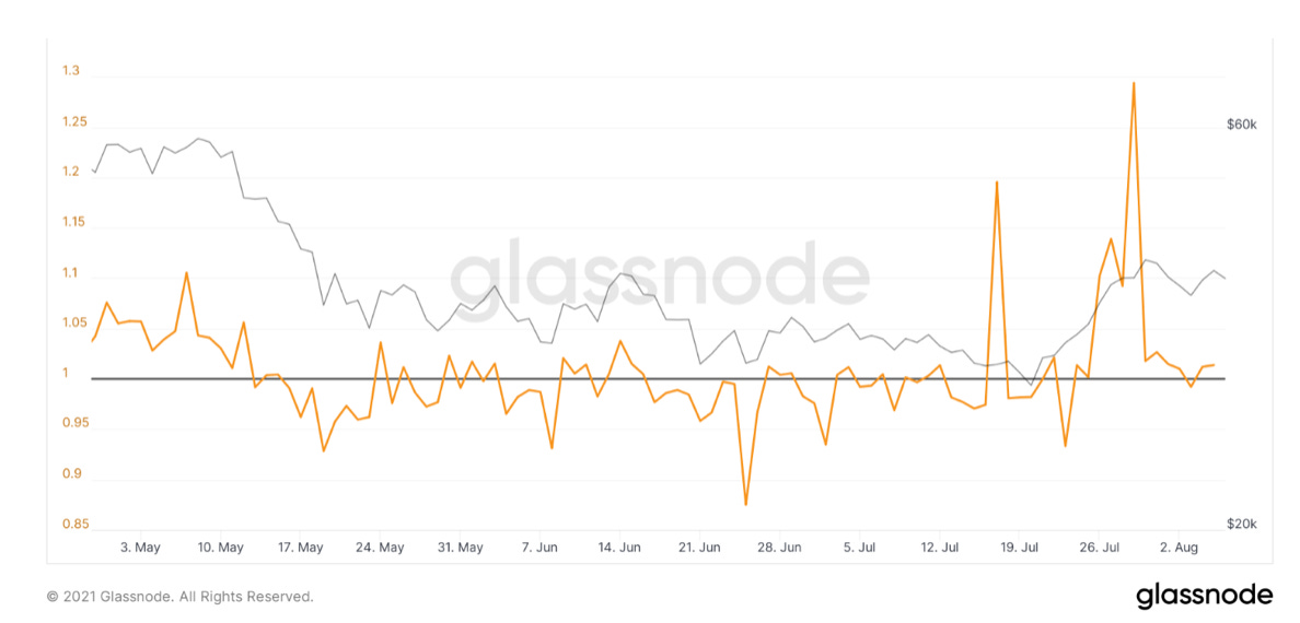
Market trading in a state of profit, got the bounce off 1 in SOPR we wanted to see
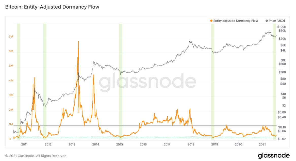
Dormancy has almost fully reset
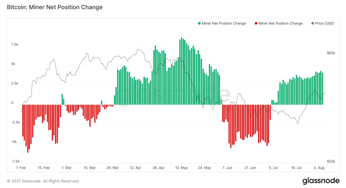
Broader trend of miners still in accumulation
What to watch for:
Could still see another retest of mid-range between $35K-$37.5K, but unlikely imo
$42,000 Range breakout/On-chain volume cluster breakout
$45,000 200 Day Moving Average
$48,000-$50,000 Key price structure technical level, Overhead supply (breakdown level from distribution), round psychological number
$53,000 On-chain price model “mean”, has been a pivotal price level historically
Potential hash ribbon buy signal
Are long-term holders dumping hard on the first bit of exit liquidity they get?
Would like to see SOPR stabilizing above 1
Want to see on-chain activity pickup, Mempool fill up
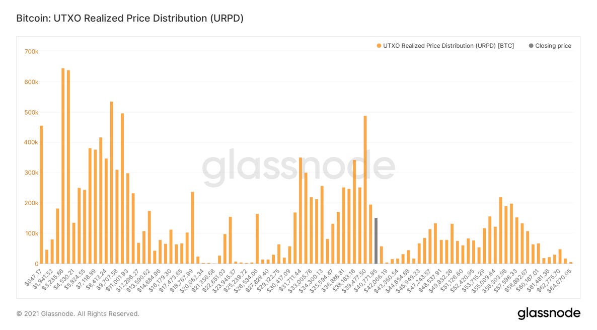
First up let’s take a look at URPD, basically an on-chain volume profile. This shows the amount of BTC moved at different price levels. We’ve now carved out this large zone of re-accumulation between $31K-$42K; 21.71% of Bitcoin’s money supply has now moved here. 2.61% of Bitcoin’s money supply has moved at $39.5K alone; making it the largest single bar of volume since $3.8K. Watching $42K and the 200-day moving average at roughly $45K for resistance on a potential move up.
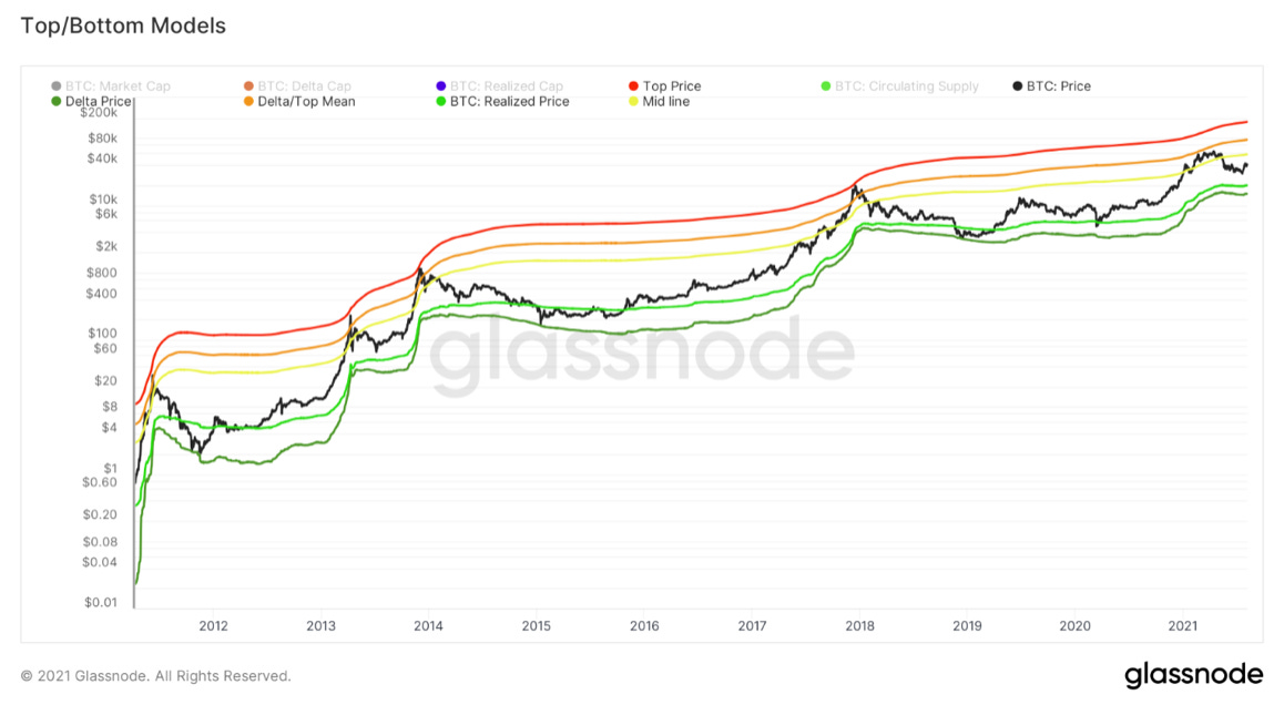
Next up we have what I labelled as top/bottom models. This looks at the Top price model (a variant of the all-time moving average of Bitcoin), Delta price (realized price – average price), Realized price, the mean between Top/Delta price, and lastly the mean between realized price and the average between Top/Delta. Overlaying these all together, we see that price has always hovered between top price and delta.
Market price going below realized price is a great signal to start accumulating heavily in macro bottoms. This is because price is below the average price investors paid for their coins; meaning the market is in capitulation by definition. Reaching the orange and red lines have marked historical overheated/euphoric price levels. Market price going above the yellow mid-line has historically been a key level for Bitcoin to confirm a strong bull market trend. In 2013 price went vertical after breaking through, bear market began after breaking below. In early 2017 served as resistance, before switching to support propelling us into the final latter phase of the bull market. Also was the level that the dead cat bounce got rejected from in 2018. Served as support in January 2021, marked the major drawdown in May, and now I would like to see us get back above that yellow line for confirmation. Currently sits at roughly $53K.
Accumulation has continued, which we can look at in several ways. In blue, Illiquid Supply Shock Ratio, which compares the movement of coins from liquid (weak hands) entities to illiquid (strong hands) entities. In purple, Exchange Supply Shock Ratio, which compares the amount of supply held on exchanges relative to overall circulating supply. Both of these are trending strongly upwards, with price lagging behind. I still am patiently waiting to see these massive multi-month-long divergences get fully priced in. Also, worth noting that the Illiquid Supply Change RSI is also in a macro buy zone, just chose not to include it this week to save some space.

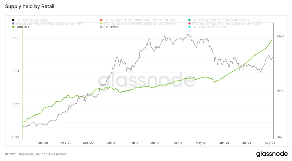
When we look at who exactly is buying by size, almost every cohort is in strong accumulation. In particular, the little guys have really caught my eye. This metric takes a ratio of all the entities on-chain with less than 10 BTC and dividing that by overall circulating supply. What you get is essentially a representation of how much supply retail holds on a relative basis. This has hockey sticked upward since late May. This along with new all-time highs in net user growth illustrate healthy network adoption/distribution.
Note: net user growth is trending up, while the number of new entities is trending down. This means that the number of “dormant entities” is decreasing at an even greater rate than the number of new entities. To me this shows that the users coming on the network are staying.
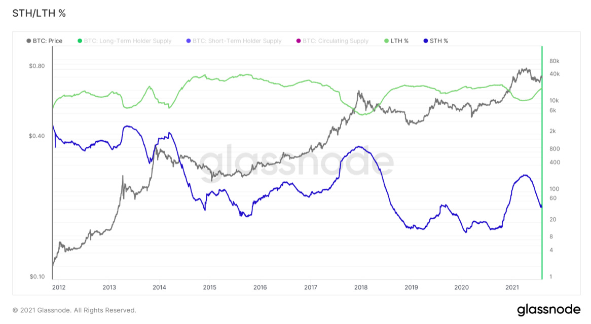
On a similar note, let’s look at the dynamic between short and long term holders that we’ve been watching for a while. Long-term holdings continue to increase while short-term holdings continue to decrease. This means two-fold: short-term holders are aging past the 155-day (5 month) threshold, short-term holders are the ones that are doing most of the selling. Pairing this with metrics like CDD, Dormancy, SOAB, and ASOL all tell a similar story.
Long-term holders now have over 66% of supply, short-term are now down to nearly 20%. Before the main bull run began in October, long-term holder supply reached just over 68%.
Next up we have dormancy flow, created by David Puell. This looks at market cap in comparison to annualized dormancy (measured in USD) on each given day. Dormancy is coin days destroyed adjusted for volume. Highlighted below (March 2020 counts too) you can see each time the metric dips near the green box a macro bottom is signaled. We have just bounced off the green box, a nearly full reset of dormancy flow. This is partially trending down because of decreased volume, thus less overall coin days being destroyed, but signals that the age in the coins being sold have been young. So once again, new market participants have been selling while long-term investors are scooping up coins.
Next up we have aSOPR, SOPR adjusted for outputs with a lifespan of less than an hour. (filters out the noise) This looks at the amount of profit held by the coins trading in the market. Last week we noted our breakout above 1 back into a state of net profit, but mentioned we wanted to see the metric stabilize above 1 or bounce off 1 on a price drop. We got a decent little price drop after getting rejected from 42K, of which the metric did in fact bounce off 1 as we were watching for. Would now like to see some stability above 1 for confirmation.
Nothing has changed with miners, broader trend still in accumulation, actually ticking up a bit this week.
The main bear case for Bitcoin from an on-chain perspective is the big drop off in transactional activity. We’re still a rut looking at things like the Mempool, number of transactions, active addresses, etc. Would like to see these things pick back up, which I personally see as lagging indicators to price. If we get a breakout towards some of the targets mentioned at the beginning of the letter, would want to see some increased activity in these metrics.
That is it for today’s analysis. Hopefully you found this helpful. I highly suggest you subscribe to Will Clemente’s email where he breaks down on-chain metrics multiple times per week: Click here
SPONSORED: Amber Group is a leading global crypto finance service provider operating around the world and around the clock with a presence in Hong Kong, Taipei, Seoul, and Vancouver. Founded in 2017, Amber Group is committed to combining best-in-class technology with sophisticated quantitative research to offer clients a streamlined crypto finance experience.
The platform now services over 500 institutions and 100,000+ individual investors across the Amber Pro web platform, the Amber App, as well as their 24/7 trading desk. To date, Amber Group has cumulatively traded more than $330 billion across 100+ electronic exchanges, exceeding $1 billion in assets under management. In 2019, Amber Group raised $28 million in Series A funding led by global crypto heavyweights Paradigm and Pantera Capital, with participation from Polychain Capital, Dragonfly Capital, Blockchain.com.
Click here to sign up now.


Are We Repeating October 2020 Before The Big Bull Run?